Modo Brand Identity
Cheltenham-based planning, land and promotion business, Modo, asked Mint + Mabel to to develop a cohesive brand identity, including a contemporary logo, custom brand patterns, and a refined stationery suite.
Deliverables
Branding design | Letter head design | Email footer design | Logo design | Brand guidelines
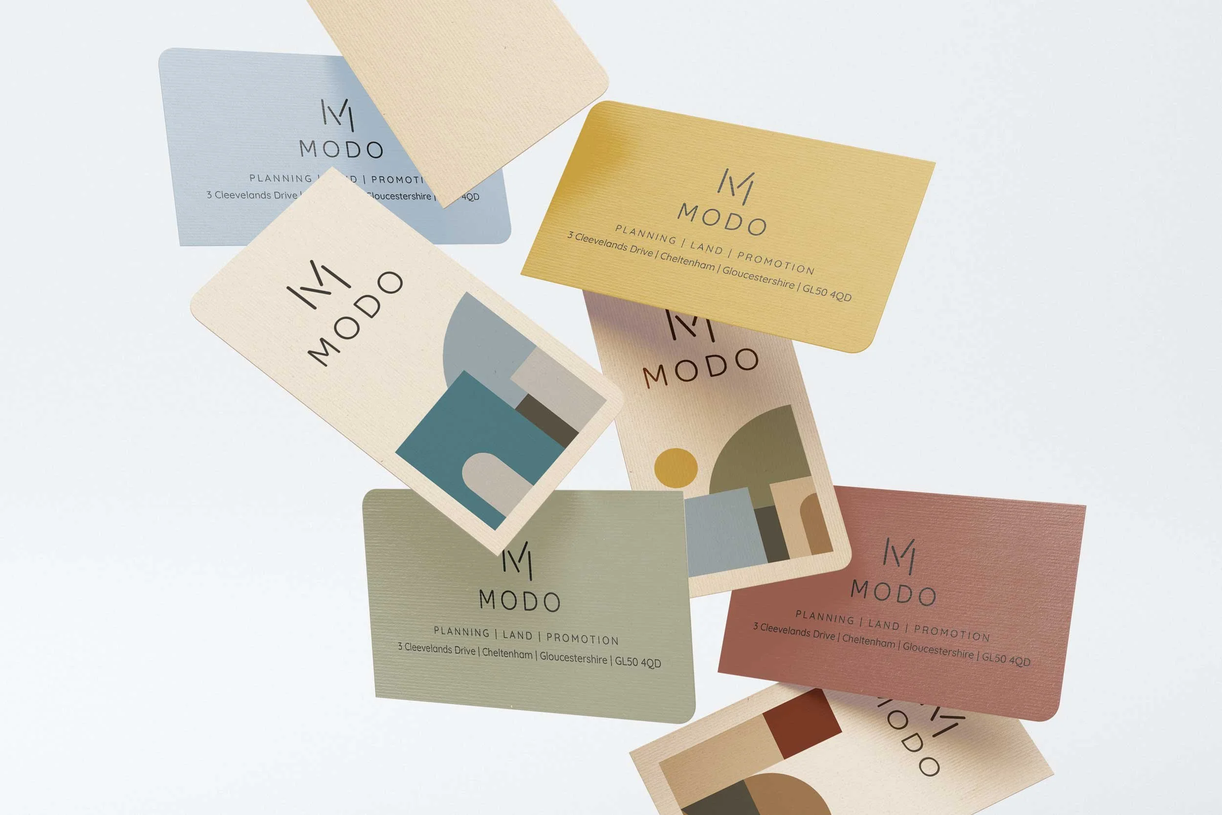
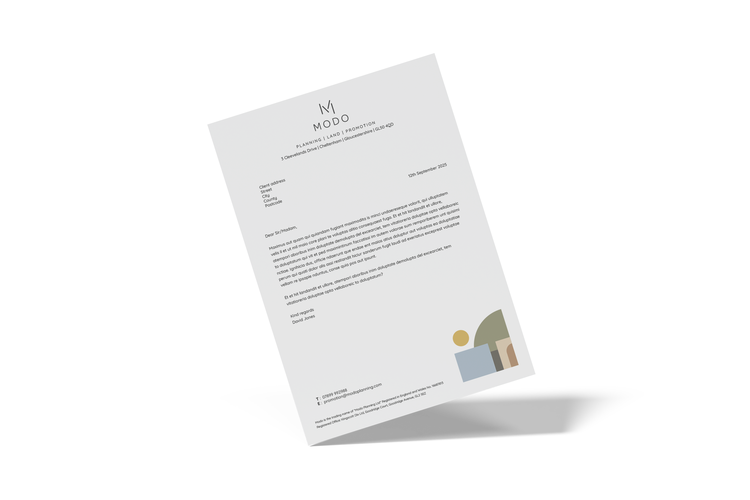
The brief for this project was to create a modern brand identity for Modo Ltd. We started off by creating different mood boards with a few options of contextual designs to then aid us in developing the visual language for the brand. The client chose the design route that had an earthy colour palette, geometric shapes and a clean modern font.
The ‘M’ icon is constructed from a series of lines that build together, creating a strong and versatile mark. We further developed the logo ideas and created a series of geometric shapes that link to each of the key services; planning, land and promotion. Each service has a specific colour way which helps clients visually distinguish between each service being promoted, ensuring the brand is both distinctive and instantly recognisable.
The brief

We also created a core suite of geometric shapes symbolising the full scope of Modo’s services. The new brand identity was then applied across stationery and email for a cohesive rollout.
Brand font – Quicksand