Battledown School Brand Identity
Mint + Mabel created refreshed branding for Battledown School in Cheltenham, who changed their name from Battledown Centre for Children and Families. The designs included an illustration style used for the animal names of each of their classrooms.
Deliverables
Branding design | Logo design | Brand guidelines | Illustrations

Following the school’s name change, the brief was to create a friendly, modern logo that incorporated the four core school values.
The new logo uses fluid lines to form leaves. These lines symbolise unity, togetherness and positive relationships. The leaves represent nurture and growth, while the circle conveys the safe and supportive environment in which the children learn.
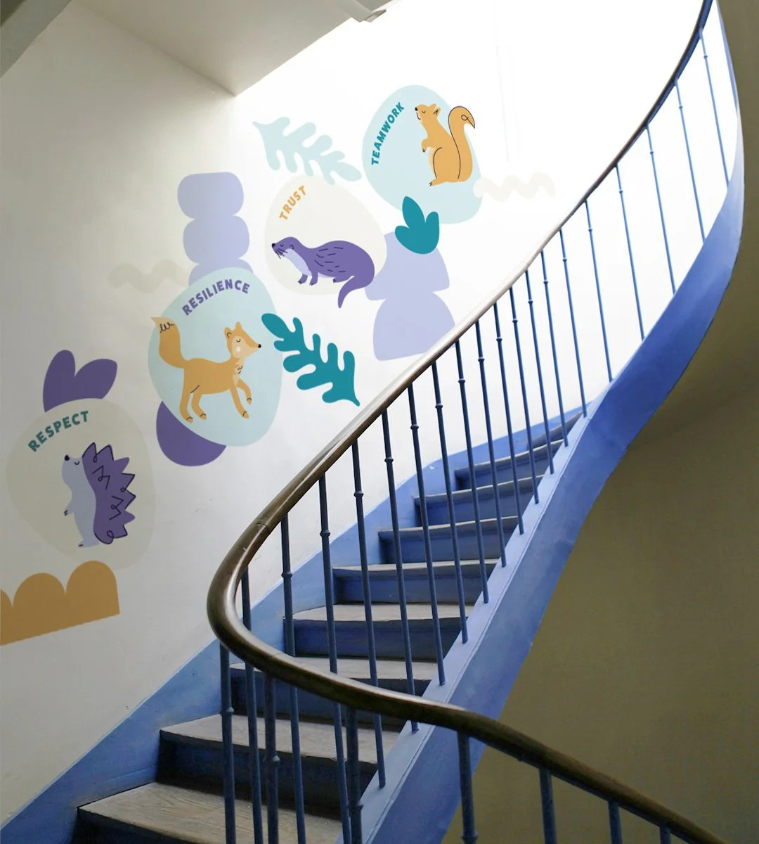
Each leaf corresponds to one of the four values the school upholds: respect, resilience, trust and teamwork. The colour palette was carefully considered to complement the SAND Academy Trust’s turquoise, along with the school’s existing use of purple, which signifies wisdom, power and ambition. Navy blue is associated with authority, stability and reliability, while yellow tones evoke warmth and happiness.
The brief

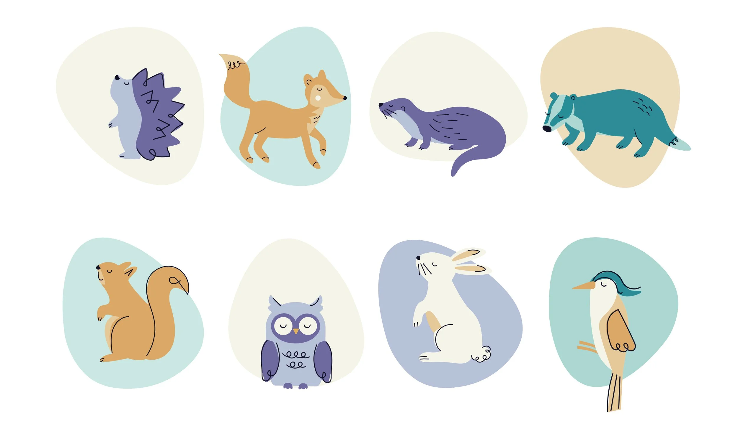
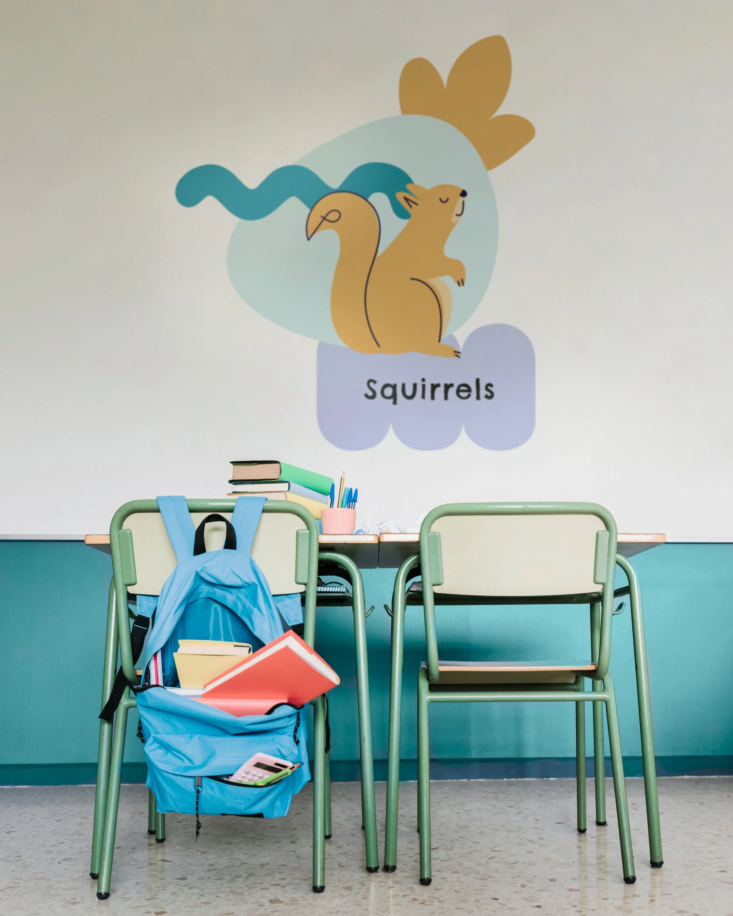
Alongside the logo design Mint + Mabel created illustrations for each classroom name; Squirrels, Otters, Foxes, Hedgehogs, Badgers, Owls, Rabbits and Woodpeckers. These have been used throughout the school along with the list of school values.
“Mint & Mabel were recommended by a trusted colleague to help produce artwork for the school's new logo and values. The team were readily available to meet and discuss initial ideas through to the final design. I was particularly impressed with how much detail and passion went into designing the logo which reflected how dedicated the team are at listening to the brief, getting to know their clients' expectations and going above and beyond to deliver. I would certainly recommend Mint & Mabel - Thank you!”
Darren Heatley, Headteacher at Battledown School, Cheltenham
Brand font – Poppins